Adobe "Modernizes" Premiere Pro With New Beta UI

Most content creators are familiar with Adobe’s video creation tool, Premiere Pro*. Yes, there’s a bit of a love hate relationship with this software, but it really does do a good job making high quality video creation accessible to many. The UI has been fine for me, but apparently, Adobe and the community thought the user interface could be improved. So, the Adobe video team is doing just that via a public beta.

Image by Adobe

Image by Adobe

Phase 1 of the beta update: removing the techno mumbo jumbo

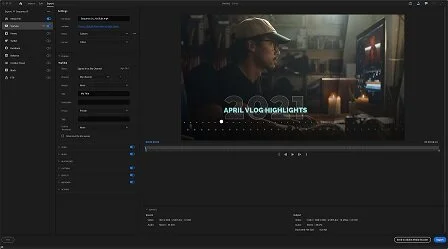
When launching Premiere Pro, the existing opening dialog to create a new project is fairly extensive. You have the open to name the file, but then you also have scratch disk, ingest and processing options to address. Most of the items on that opening dialog really isn’t needed just to “create” a new project. Adobe and the community has realized that and is getting rid of this information. Adobe is streamlining this opening dialog for a more visual interface allowing you to see your media and set necessary project parameters on one screen instead of multiple tabs. It ALMOST looks like the opening screen of Premiere Rush. Almost.

Image by Adobe

Image by Adobe

Once you’re into your project, the timeline interface and workspace looks fairly similar with a few tweaks to the menus and panel headings. For example, the main header bar is not as big as it used to be. This now gives you a few more pixels of screen space for your source and program monitors. Adobe states that this is an effort to not only give a few more pixels of screen real estate, but also an effort to unify the user experience (UX) across other Adobe products such as Photoshop, Lightroom and After Effects.

Exporting the content you create is very similar to the Premiere Rush interface. You get a couple presets to handle the export based on the platform where the content will be viewed. Video formatting varies from platform to platform. Having presets allows your content to be viewed in its best format on the platform without a bunch of compression and artifacts.

As a Premiere Pro* user, I will have to ease into the new redesign. I’m a creature of habit when it comes to using my creative apps. Heck my current layout of Premiere Pro has a custom workspace that I set up to better fit my needs. Fortunately, this will still be an option for us old dogs struggling to learn new tricks.

This is only the first phase of the new interface redesign. Adobe didn’t specify a timeline for subsequent phases, but wanted to reiterate that phase one is all about getting started with a project as well as the export process. Adobe did mention that more updates are coming to the Lumetri color panel as well as background video rendering beyond using Adobe Media Encoder software. Find out more about the beta here on the Adobe blog.


(*) Affiliate link used. When you use my affiliate links, I receive a small commission from your purchase at no additional cost to you as the consumer. Thank you for your support

Learning A Lot From Office Hours With Alex Lindsay

I’ve had the pleasure to meet Mr. Alex Lindsay a few years ago since moving west. There was so much I didn’t know about him beyond the world of seeing him on TWiT TV. After meeting him and shooting a show with him, the pandemic happened. For him, the pandemic mattered not. He and his business partners pivoted and created something I enjoy each week that’s designed to help content creators learn more about the craft. It also serves as a great community for open discussions about the topics shared and learned. it’s called Office Hours.

Every now and then I’ve joined Office Hours as a panelist to answer questions that I may actually be familiar with. A lot of the time, I have no idea as I’m not a creator that’s out on movie sets in Hollywood or someone that livestreams large productions on a regular basis. But it’s nice to be able to contribute where I can.

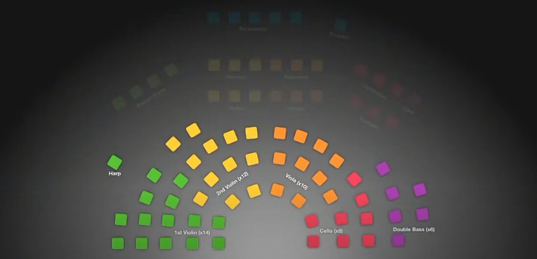
On this episode below, the second hour of Office Hours focused on orchestral recording and how to position the mics. It’s such a nuance skill. The presentation was handled by Karl Asmussen of Australia. Sorry, I can’t find a website or social media profile to link to him. Anyway, watch his presentation by clicking the image below. You’ll learn a LOT.

Image screencap from Karl Asmussen

Image screencap from Karl Asmussen


New Discount For BlackMagic Design ATEM Mini Pro Line

BlackMagic Design is now offering $100 discount on its ATEM Mini Pro and ATEM Mini Pro ISO. These devices are quite popular in the world of video production and became even more popular with the 2020 pandemic as more people were creating content remotely.

More about the ATEM Mini Pro and ATEM Mini Pro ISO

The ATEM Mini line of products is a cool piece of hardware offered by BlackMagic Design to be used for video switching. Well, that’s the simplistic explanation. The ATEM Mini line has a couple of different SKUs. You have the ATEM Mini, the ATEM Mini Pro , ATEM Mini Pro ISO, ATEM Mini Extreme and ATEM Mini Extreme ISO. Whew that’s a lot. Thing is, they’re pretty useful for whatever level of video production you need.

The ATEM Mini Pro and Pro ISO are popular because of their livestreaming integration as well as the isolated track recording. Not something everyone needs, but still useful. I usually recommend the base ATEM Mini as it’s useful for most anyone.

The discount is $100 off on the ATEM Mini Pro and the Pro ISO on Amazon and Adorama , which are my affiliate links.

image by BlackMagic Design

image by BlackMagic Design


Big Updates Coming for LumaFusion on iPad

So earlier this week Apple had its Spring Loaded event announcing a lot of new product offerings and tech for the masses. This included updates to the iPad. The tablet that I have a love-hate relationship with.

The iPad hardware is clearly a technological wonder when it comes to consumer tech. It’s beautifully designed and has a fairly intuitive interface. Fairly. (Don’t get me started on the iOS “file system.” ) With this update, app developers are able to offer tools to harness the power of the iPad. LumaTouch is one of those companies set to make a lot of noise in this space.

LumaFusion 3.0 coming soon

If you don’t know, LumaFusion is notably the premiere video editing app on iOS. This isn’t your typical touch-based app that allows you to just do cuts and a few overlays on your video file. This is a full-fledge creative tool offering video editors options to make their art shine. Just as if they were within a NLE app such as Final Cut Pro or Premiere Pro.

image credit LumaTouch

image credit LumaTouch

LumaTouch announced version 3.0 for its LumaFusion app. The update is set to have a “feature pack” aimed directly at harnessing the power of the newest iPad Pro. These feature packs will be part of in-app purchases. Some of the features offered will be real time scopes for both SDR and HDR color spaces as well as multicam sync.

LumaFusion 3.0 will be available in “summer 2021.” I guess that’s fine considering the new iPad won’t be shipping until then.

There's NO Point in Buying $1000 Smartphones

I'm pretty tired of phones of today being $1000. I don't think they're worth it. Please know that there are other options out there for less money, yet still have flagship performance. Here's the TCL 10 5G smartphone. And it's NOT for $1000. Click the photo below to check out my video where I take a look at this phone. Order it here if you’re interested.

Don't Forget About Panasonic

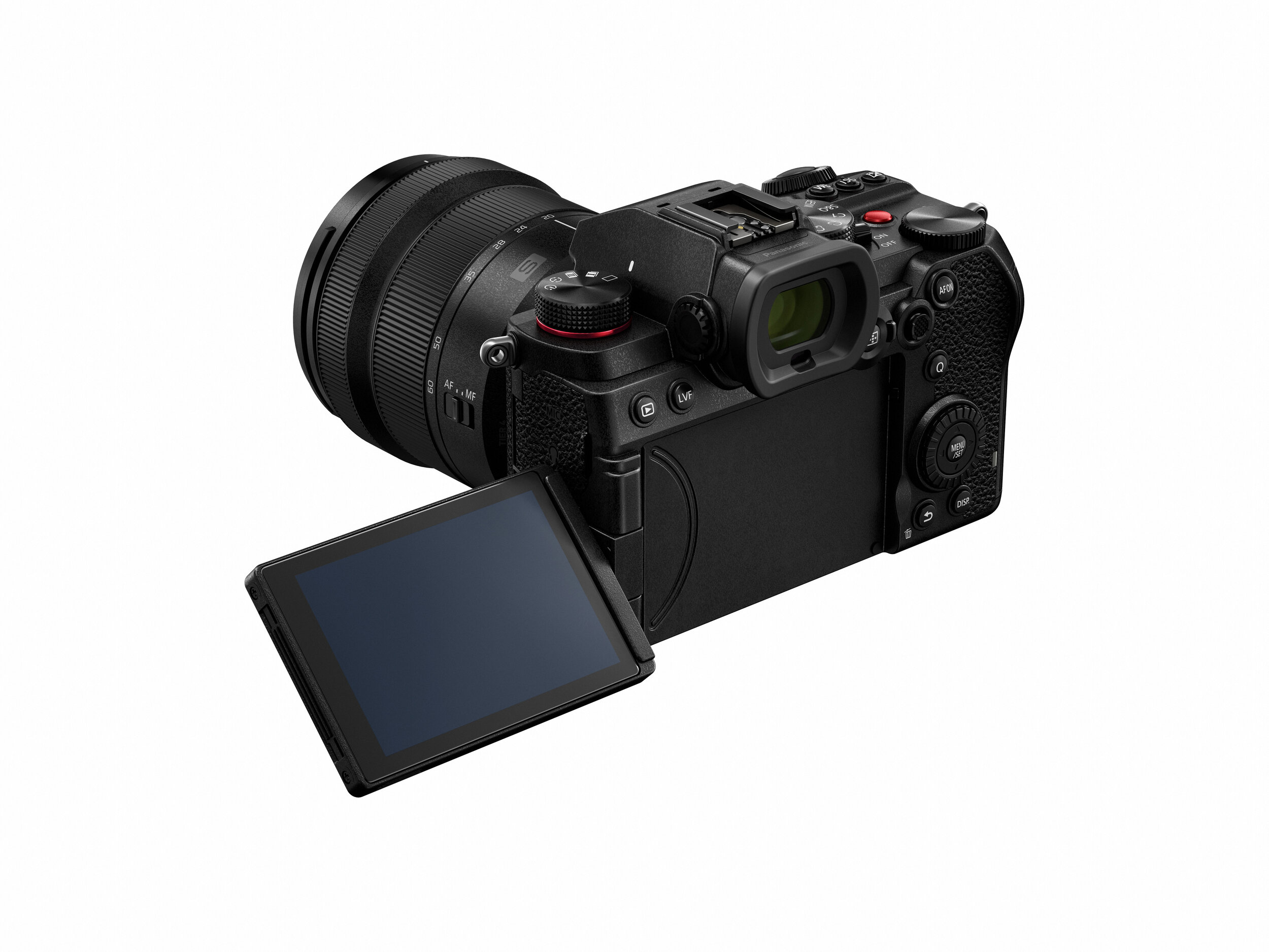
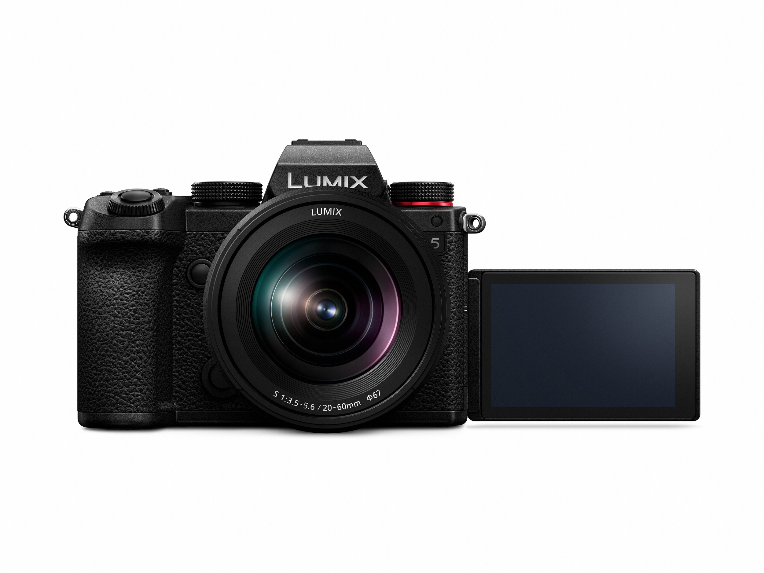
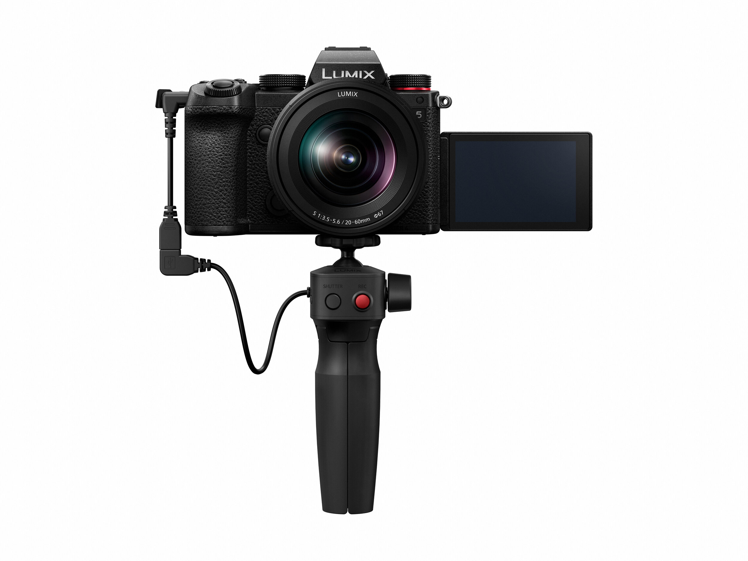
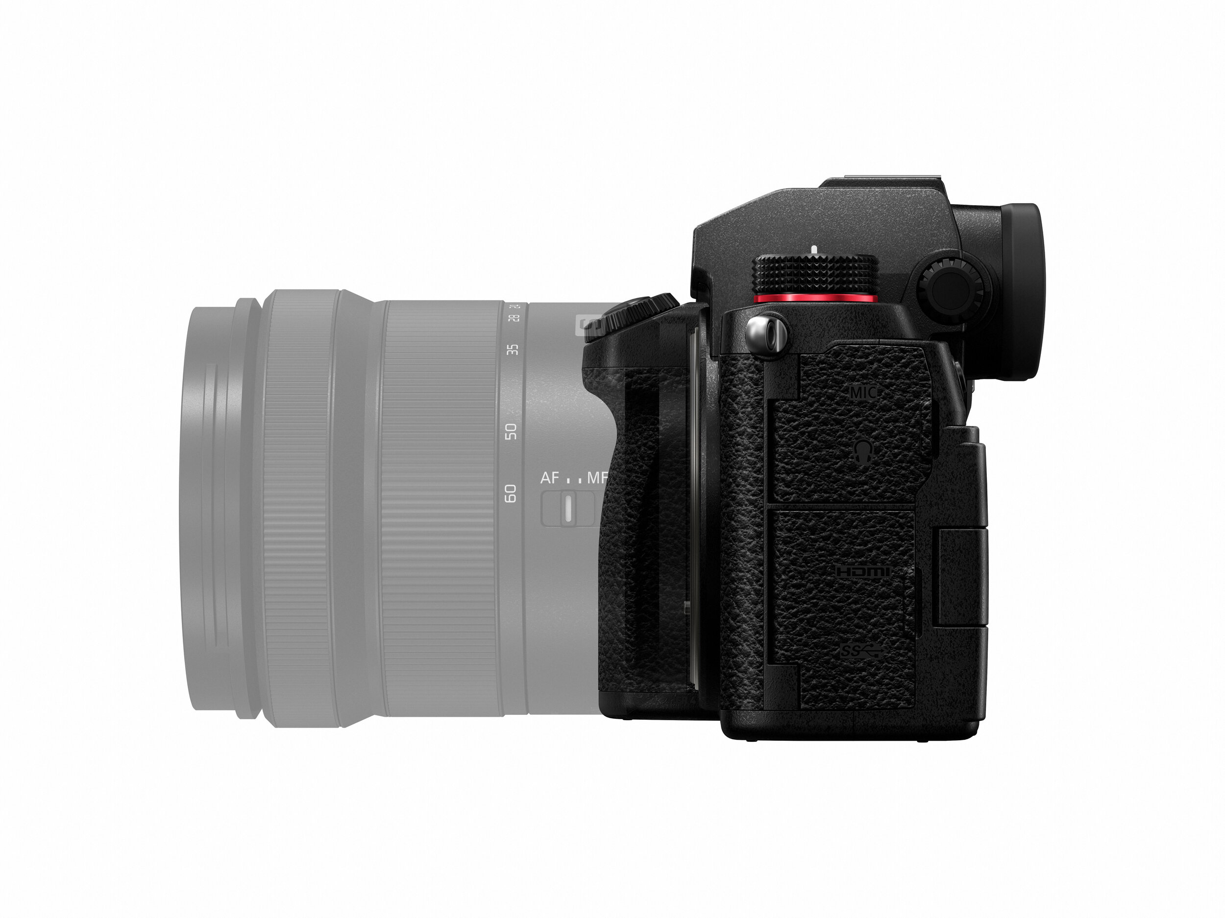
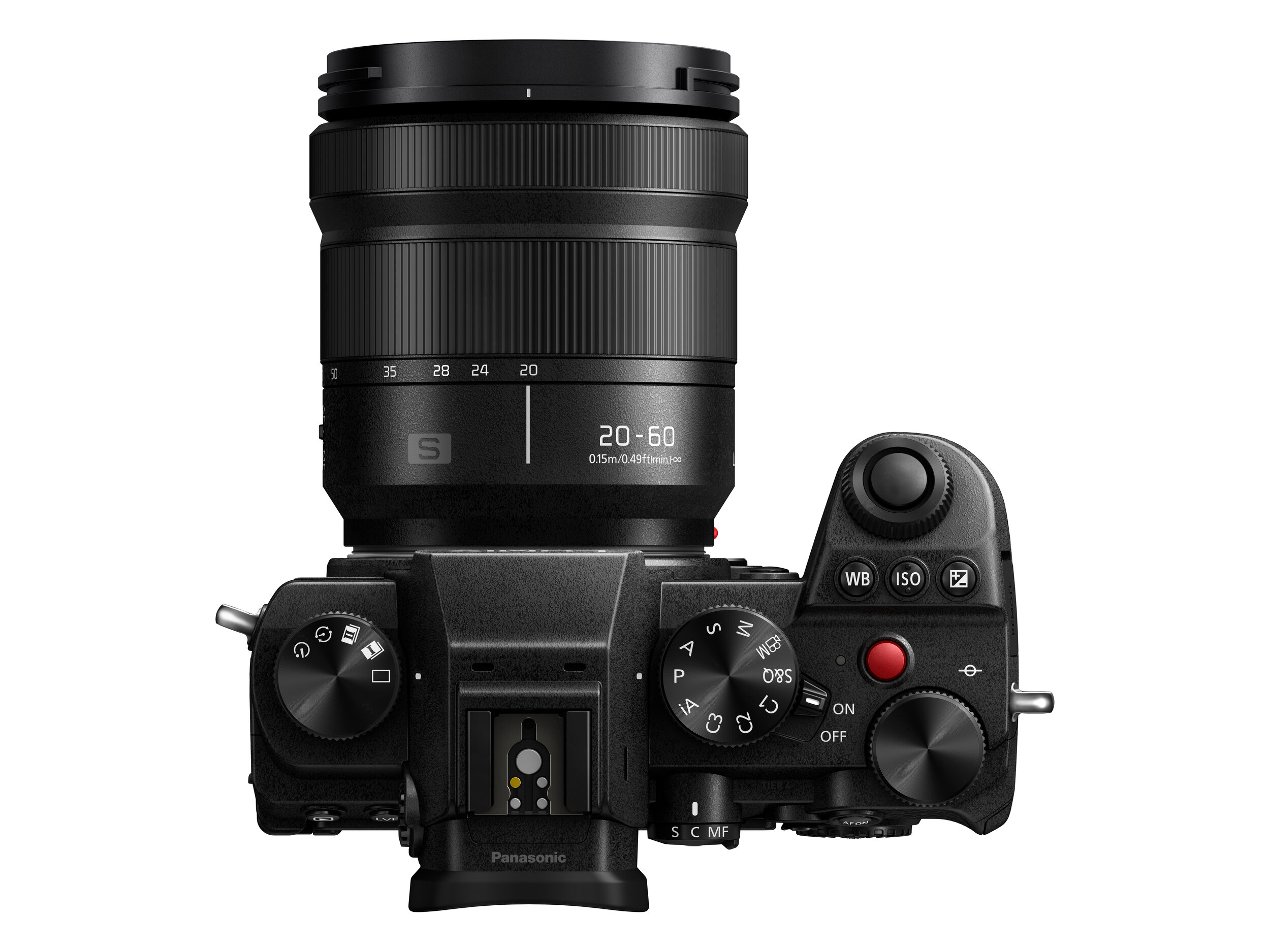
With all the madness and going on with year 2020, it didn’t mean the camera companies were going to stop production of their consumer or professional products. Today, Panasonic announced its latest s-series camera body with the S5*. Another full-frame mirrorless option for today’s consumers.

The content creation industry continues to grow. Creators are constantly looking for the best tool to suit their needs. Some from Canon, some from Sony or Nikon, some from Panasonic. The S5 is popping into a sweet spot touting high quality performance at friendly price.

Tech Specs

  • 24 megapixel full-frame sensor, native 3:2 aspect ratio

  • Full-frame 4K (UHD), 10-bit, 30 frames per second video

  • HD video up to 180 frames per second

  • 2.3 million dots electronic view finder

  • dual SD card slots (1 UHS-II, 1 UHS-I)

  • in-body stabilization

  • WiFi and bluetooth connectivity

  • Seven frames per second high speed burst mode shooting

  • HLG and V-log video profiles

  • micro HDMI I/O

  • fully articulating rear screen

From the looks of this camera body, it’s checking all the applicable boxes for enthusiasts and content creators to take great photos and film good looking video. The body seems a bit smaller than what I’d like, but the advantage is the weight will be much lower at less than two pounds (body only). Perfect for most. I’d probably struggle with it in my large hands, but this is definitely looking like a capable body from information shared in the tech specs. You’re not going to get ALL of the video shooting capabilities of the S1H* such as 6K video, but you’re also not paying the same premium price. But, being able to shoot video in LOG is awesome.

(All images provided by Panasonic)

Pricing starts at $1998 for pre-order.* Check out the video demo from the squad at Adorama* down below. I’ve reached out for a loaner to play with for myself and maybe do a segment on Hands On Tech. I’ll keep you posted.


*Affiliate link used. Affiliate links allow me to earn a small commission as a content creator if you purchase items using the affiliate link. Thank you for your support.

Smooth Video For Your Smartphone With the DJI Osmo Mobile 4

During quarantine, creators are having to make more out of the limited resources they have on hand. This means shooting more at home and using their smartphones more often for photo or video content. Today, DJI launched its latest tool for mobile content creators - the DJI Osmo Mobile 4*.

image via DJI and Adorama

image via DJI and Adorama

I’ve used gimbals before and they’re great for getting smooth footage for your project. I also own a couple smartphone gimbals. As a matter of fact, one is the Osmo Mobile 2 and the Zhiyun Smooth 4. I enjoy using both of them. And now-a-days, I’d use them more for shooting clips around the house.


The Skinny On the Osmo Mobile 4

So there’s not much to say on the tech specs because gimbals aren’t anything new to the creative space, but what DJI did to make this new product newsworthy is change up the ease of use. DJI added a magnetic clip allowing you to connect your smartphone in a few seconds. No more battling with clips and clamps. No more hoping your external microphone doesn’t get caught up in the clamps or arms of the gimbal. Nice. You’ll get your typical calibration tools for the motors as well as features such as time lapse mode and gesture controls. All of these are useful when trying to make your Instagram stories or TikTok videos pop. I also like the foldable form-factor that was present on the previous version of the Osmo. Great for packing and portability. Nice move, DJI.


I’m not sure if I’ll buy one of these since I already have two gimbals on my shelf as I write this, but I am definitely curious about the quick connection magnet. Looks like a great idea. Hopefully it has a great battery life and still allows you to charge it while being used as an added convenience.

You can get the DJI Osmo Mobile 4 for $149* online. Let me know if you decide to order one or have any questions about using a smartphone gimbal.

Image from DJI and Adorama

Image from DJI and Adorama


*Affiliate link used. Affiliate links allow me to earn a small commission as a content creator if you purchase items using the affiliate link. Thank you for your support.