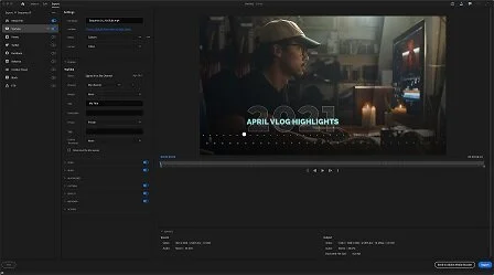
Once you’re into your project, the timeline interface and workspace looks fairly similar with a few tweaks to the menus and panel headings. For example, the main header bar is not as big as it used to be. This now gives you a few more pixels of screen space for your source and program monitors. Adobe states that this is an effort to not only give a few more pixels of screen real estate, but also an effort to unify the user experience (UX) across other Adobe products such as Photoshop, Lightroom and After Effects.
Exporting the content you create is very similar to the Premiere Rush interface. You get a couple presets to handle the export based on the platform where the content will be viewed. Video formatting varies from platform to platform. Having presets allows your content to be viewed in its best format on the platform without a bunch of compression and artifacts.
As a Premiere Pro* user, I will have to ease into the new redesign. I’m a creature of habit when it comes to using my creative apps. Heck my current layout of Premiere Pro has a custom workspace that I set up to better fit my needs. Fortunately, this will still be an option for us old dogs struggling to learn new tricks.
This is only the first phase of the new interface redesign. Adobe didn’t specify a timeline for subsequent phases, but wanted to reiterate that phase one is all about getting started with a project as well as the export process. Adobe did mention that more updates are coming to the Lumetri color panel as well as background video rendering beyond using Adobe Media Encoder software. Find out more about the beta here on the Adobe blog.


